
RAMO
Concert ticket resale platform for music enthusiasts
An end-end app designed to improve efficiency and avoid scamming of buying resale concert tickets.OVERVIEW

RAMO is my first end to end app design project with original brand identity. As a regular concert goer and music enthusiast, buying ticket on resale market is always a headache for me and my friends. Thus I choose this topic with great passion. I want to explore and find a potential ideal solution for all people like us. And get the most realistic user feedback for my first project.
ROLE
Sole Product Designer, UX/UI Design, Branding
TIMELINE
4 months / Jun - Sept 2022
PROJECT TYPE
Personal Project
WHY RAMO?
Music to me is always associated with memories. Specific songs bring back special moments that happened in the past. Those special moments always associate with my feelings at that moment. So two words came to my mind - RAM and MEMO.
I hope RAMO works like a RAM that stores your memories, brings back your precious feelings.
I hope RAMO is also a memo that reminds you:
NEVER TOO LATE FOR GOOD MUSIC
NEVER TOO LATE FOR GOOD MUSIC
PROBLEM STATEMENT
How might we enhance the experience of purchasing concert tickets on resale market, and without being charged unnecessary extra fees or getting scammed?
THE SOLUTION
✦ Efficiency and Trust System is the key


RESEARCH
DESK RESEARCH FINDINGS
“More than half of the people won’t be able to get the ticket even though they waited online when it was released.”
“More than 80% of people do not believe additional service fees are justified and find it frustrating.”
“57% of people expect ticket platforms to protect them from excessive prices.”
“The social network offers no protection or recourse. This closed loop of ticket selling-buying experience encourages people to rely on its bubble and thus more likely to fall for a scam post.”
✦ Music fans have major complaints about the resale platform’s additional service fees and have a hard time finding trustworthy sellers on social networks.
PRIMARY RESEARCH
➊ COMPETITOR ANALYSIS
I analyzed 5 major ways of purchasing resale concert tickets and found out:
StudHub, SeatGeek and VividSeats as three major resale platforms. They all have extremely high service fees. And the price of the ticket is normally double the original. Also, tickets for small concerts (especially electronic music) are not accessible in the app. (Excluding TicketMaster because the platform will lead users to other resale platforms.)
Facebook group is a great way to see options, but nothing is guaranteed.
Dice does not allow users to sell tickets directly in the app (transfer only). For sold-out events, users can only join a waitlist. However, those tickets will normally be available on Facebook group from individual sellers.
➋ QUANTITATIVE DATA - SURVEY
I conducted a Google survey with 9 questions (semi-structured) asking about general experience on purchasing concert tickets and received 33 of feedback. The result shows:
69.7% of the participants are not willing to pay extra at all or less than 10% for resale tickets.
45.5% of the participants were concerned about ticket legitimacy, whereas 66.7% were concerned about prices while purchasing last-minute tickets.
Based on this and plus all the answers from the survey, I found out:
✦ People are forced to accept and use resale platforms with the exceeded price because they don’t want to waste time negotiating the price with an unknown seller and judging if it’s a scam.
➌ QUALITATIVE DATA - USER INTERVIEWS
In order to get a more solid confirmation of my analysis result. I recruited 5 participants for interviews (ages: 27-32) who identified as music enthusiasts - the measurement criteria for this is to go to concerts at least 3 times per year. All participants have experience of purchasing tickets from both official resale platforms and social media groups. And in most cases, they are not willing to pay more than 15% of the original ticket price for resale tickets.
I asked them questions about their experience of purchasing concert tickets from both existing resale platforms and social networks. And had them walk me through their thought process of finding the right ticket they needed. Including judging the seller, comparing the price, time consideration and if there were any scamming experiences.
Referring to the interview quotes, I did 2 rounds of Affinity Mapping. First dividing them into categories, then separating them by “In scope” and “Not in scope”.
↑ Thematic Analysis 1
↑ Thematic Analysis 2
INSIGHTS
Based on the trend in Affinity Mapping, there were THREE themes that stood out :
✦ Users are seeking “time” - fear of long negotiation and judging the seller’s legitimacy.
✦ Users dislike nonsense prices - fear of hidden fees, but there’s still flexibility for price.
✦ Users need clarity while searching - fear of finding info in different styles of listings.
IDEATION
PERSONA
With the insights from research results, I created this persona named Derek. My persona helped me emphasize the user and establish the visual design for this group.
USER FLOW
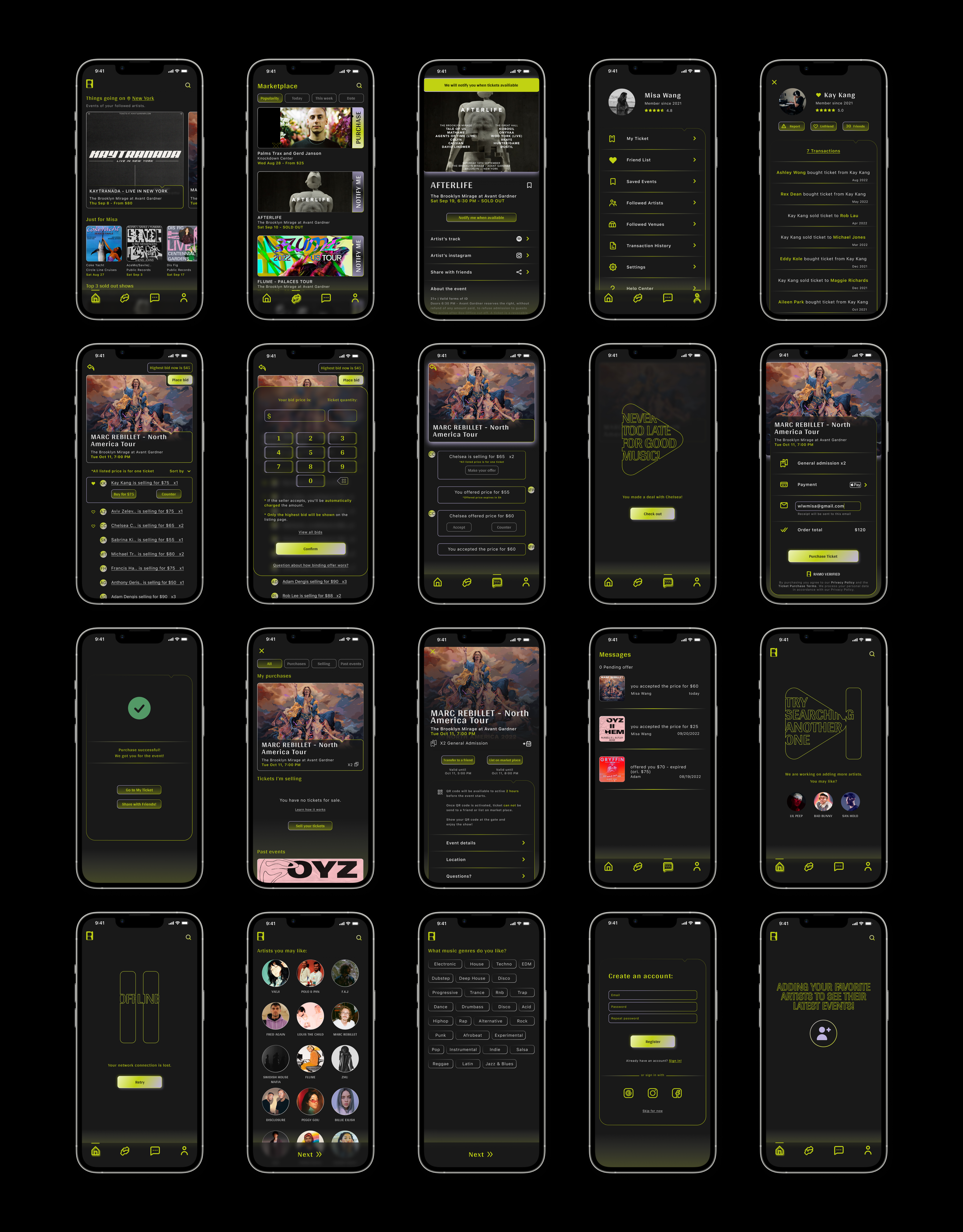
My user flow reflects two routes of using RAMO - as Buyer and Seller. Due to the time limitation and scope of this project, I decided to focus on buyer’s flow and included MVP of “finding ticket”, “counter price”, “check out” and “see purchased ticket”.
With the two key words (efficiency and price) in my mind, I know I have to cook these features together in order to maximize the user needs. After a few days of brainstorming, I decided to go with the idea of “counter price with short time frame”.
Second, in order to build trust among users. I think it’s not enough just having to “add a friend”. It’s also important to show social status. Thus, I added a small detail next to the user name on the listing page that “solid heart icon” means “friended”, and “hollow heart icon” means “this user had a transaction with your friend before”.
↑ Initial SketchesWIREFRAME
Before I started building the wireframe, I made a clickable prototype on the phone based on my sketch to see “Would my idea ever be understood by users?” (lol) I did Guerilla test on one of the interviewees. And here’s what I found out:
↑ Mid-fi Prototype Flow
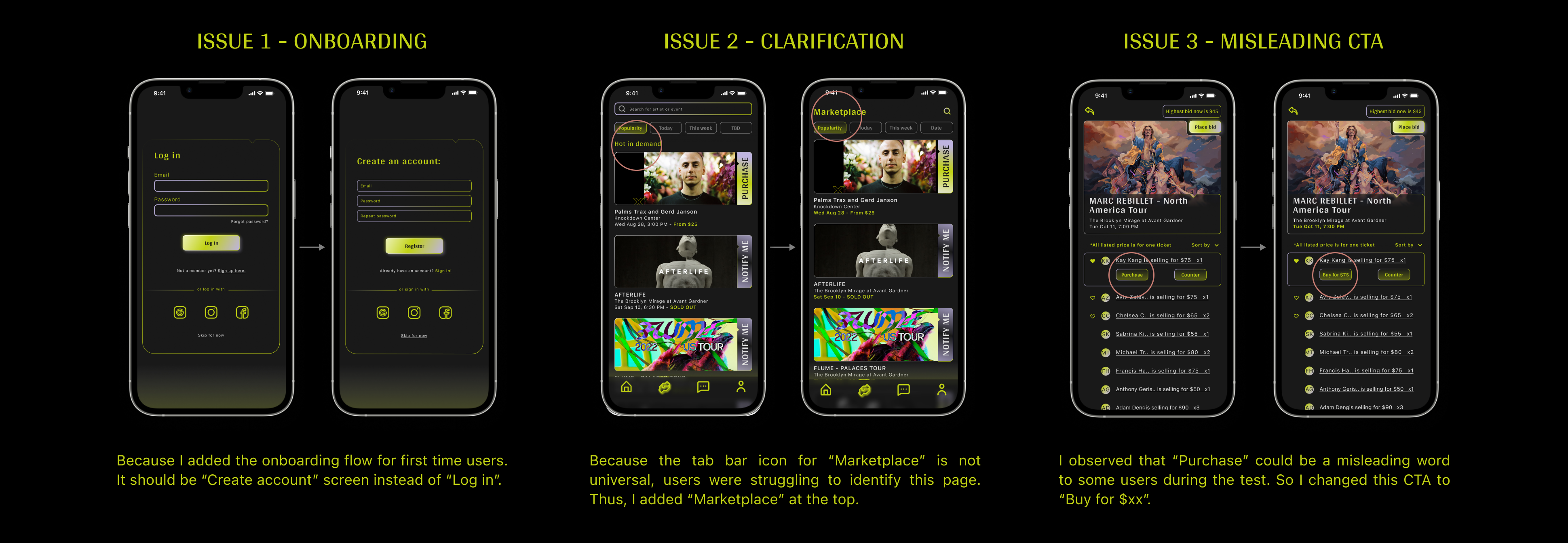
In the wireframe, I also added the onboarding flow that first time users will need to pick their preferred music genres and artists. They will also have the option to “skip for now” and jump directly to the Homepage and still be able to see the ticket price on the Marketplace.
VISUAL DESIGN
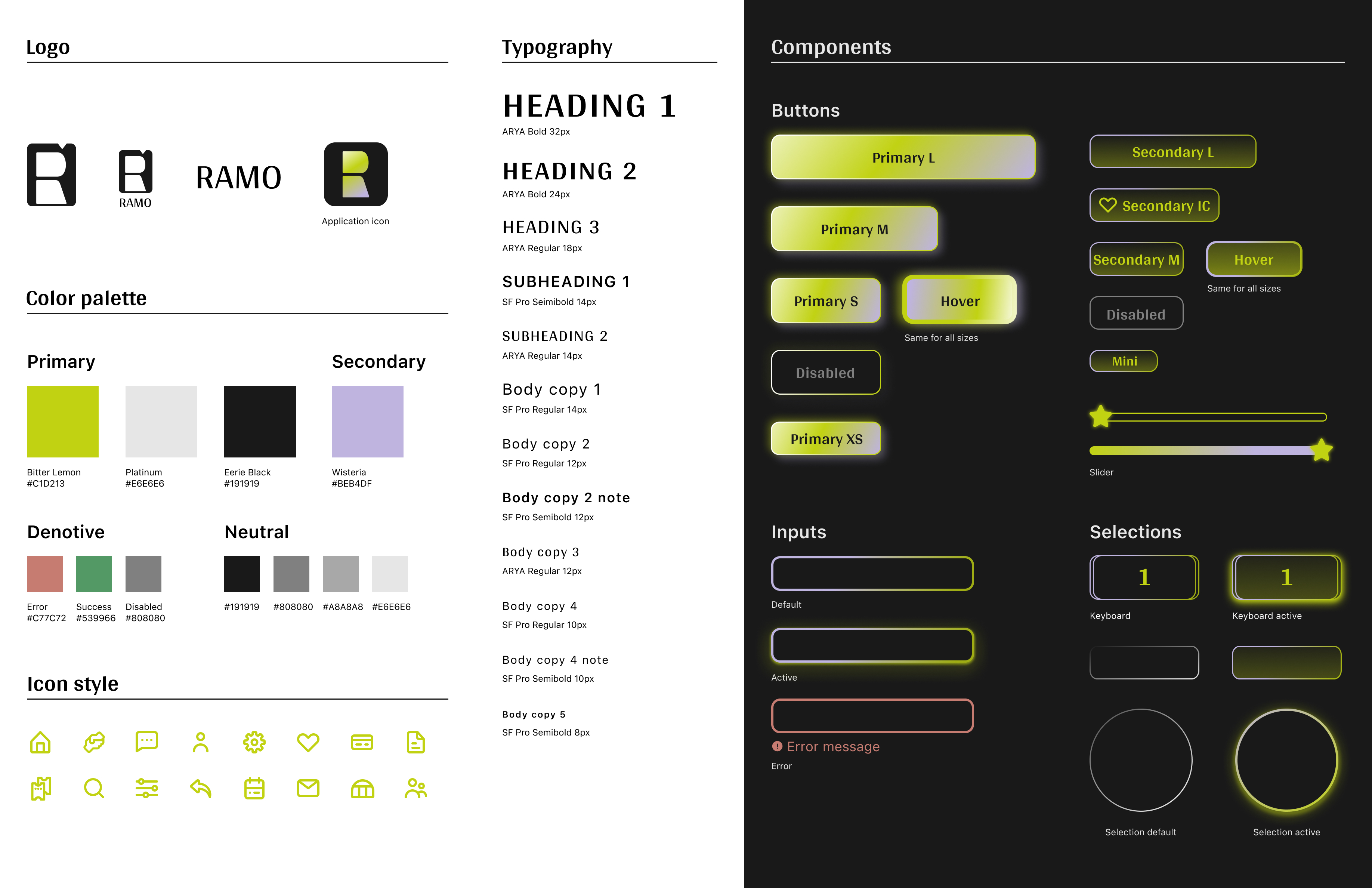
VIBE AND LOGO
Overall, I would like the vibe to be Dynamic and Futuristic. In the concept pictures, you can see the usage of “reflection highlight”, “ombre”, “geometric shape” which inspired me on the design. On the logo and icon I’m trying to incorporate the shape of an actual ticket or computer ram chip.
↑ Logo and App IconEDGE CASES
By incorporating those universal music player symbols with the edge cases design, I want RAMO users to have a full “music experience” when using the app, not just see it as a ticket resale platform. This is also my favorite design detail for this app.

↑ Edge Cases Graphic Design
↑ Loading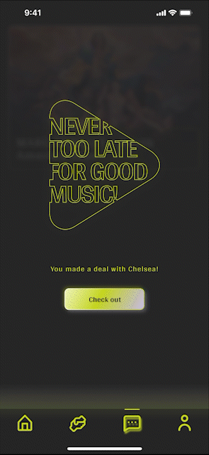
↑ Check out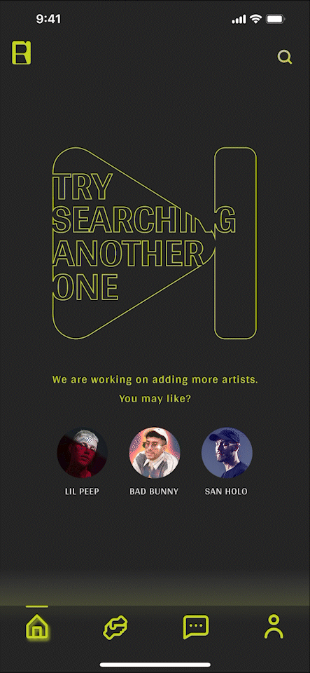
↑ Searching artists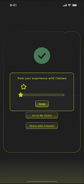
↑ Rating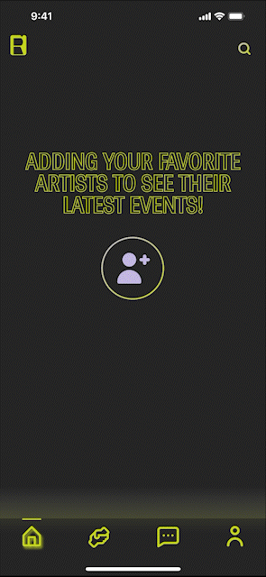
↑ Adding artists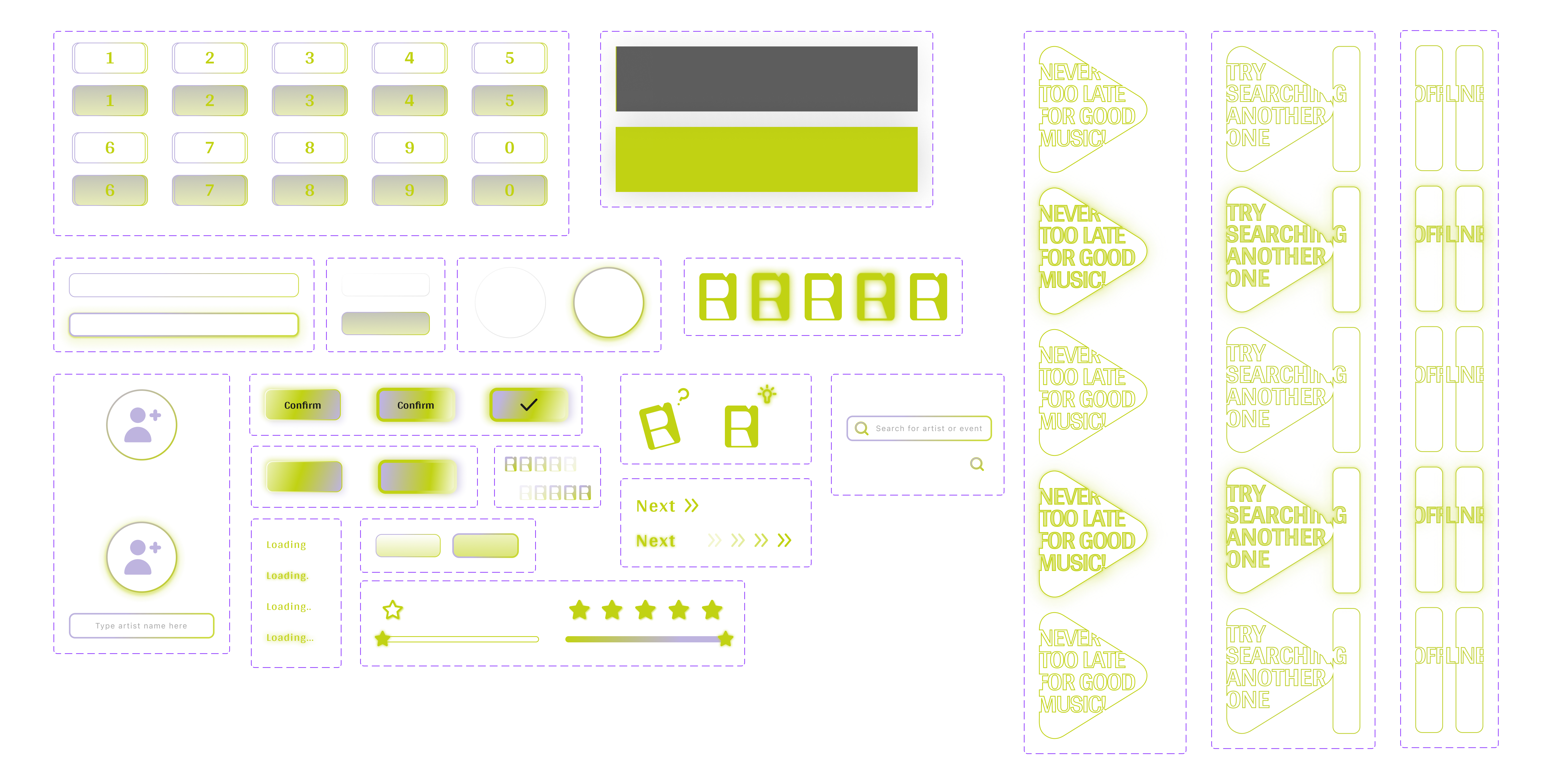
COLOR CHOICE
I decided to go with a dark background in order to show the color more and also create a “concert” mood. Bitter Lemon as primary color - stands out with a neon light feeling and brings excitement while searching for ticket. Wisteria as secondary color - adds a bit of mystery accent.
HI-FIDELITY PROTOTYPE
USABILITY TESTING
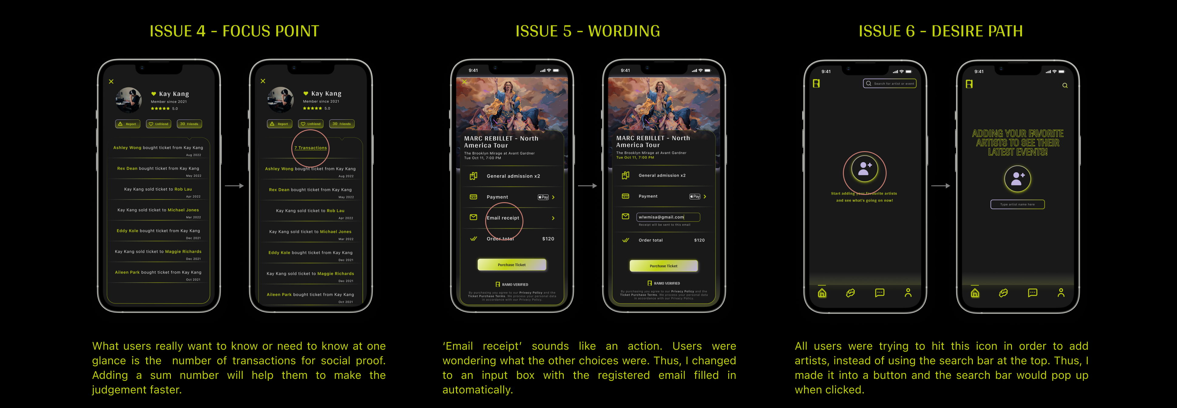
The last round of Usability Testing was done after I finished the High-fid prototype. 3 users were invited to test on mobile device in person, followed by showing Figma file for opinions. The objective this time is to check if the red route flow (as a buyer) is smooth. And whether all the UI elements are clear and easy to understand. Here are the 6 issues I discovered through the test.
✦ Final design after the iterations.
PRODUCT DEMO
Demo is showing the red route as a buyer (First-time user).
Click the picture below to start the demo video.
SUCCESS METRICS
In order to measure the success of RAMO, first I would assume we have the data of “How soon will it take for concert goers to find and successfully buy the ticket they need?”. This data should be separated into two categories: time on other resale platforms and time on dealing with third-parties (e.g. FB market).
For example, if we found that the current path to buying a secondhand concert ticket from initiation to completion took people an average of 2 days through existing resale platforms (longer decision time?), and and average of 5 hours through third-party (impulse buyers situation). I'd set the project goals under that and compare the average estimated time when RAMO users finish this process.
Furthermore, task completion rate and retention rate can also be used here.
FINAL THOUGHTS
Kicking off with this topic for my first UX project was an excellent choice. I can’t explain how much excitement I had while working on it because it is a problem I have been paying attention to for a long time. I feel very grateful to have worked on the entire process by myself and discovered more things than the course taught me.
✦ Swerving direction led me to the real problem.
What’s interesting is, my initial problem statement was focused on the scamming issue only. Because I can see how many music fans are getting scammed by purchasing resale tickets (including myself). However, the research told me scamming is more like a side effect due to the major problem.
✦ Slow down and be diligent about logic.
I treated my project as a real design because of my passion. So I spent a lot of time thinking about the logic behind every design decision. Things like: ”How would sellers upload their tickets from other platforms?” or “How would RAMO verify the ticket for users? Do we generate a new QR code or use the one from previous platform?”. Although those questions are not solved in my project because I don’t have enough knowledge yet. But I think they helped me a lot with building the user flow and being more empathetic all the way through.
✦ Having the correct user for feedback.
I’m glad I have a group of friends who really enjoy music and go to concerts a lot. They helped me test my product step by step and provided so much valuable advice. Every time after the test, I feel so inspired and this really encourages me to improve the design.
Last but not least, near the end of this project, TicketMaster released the new feature of “Sell your ticket from any platform”. Spotify announced they will partner with TicketMaster and start selling concert tickets. These two news really caught my attention and I can’t wait to explore the design of those features and learn from the real world perspective.